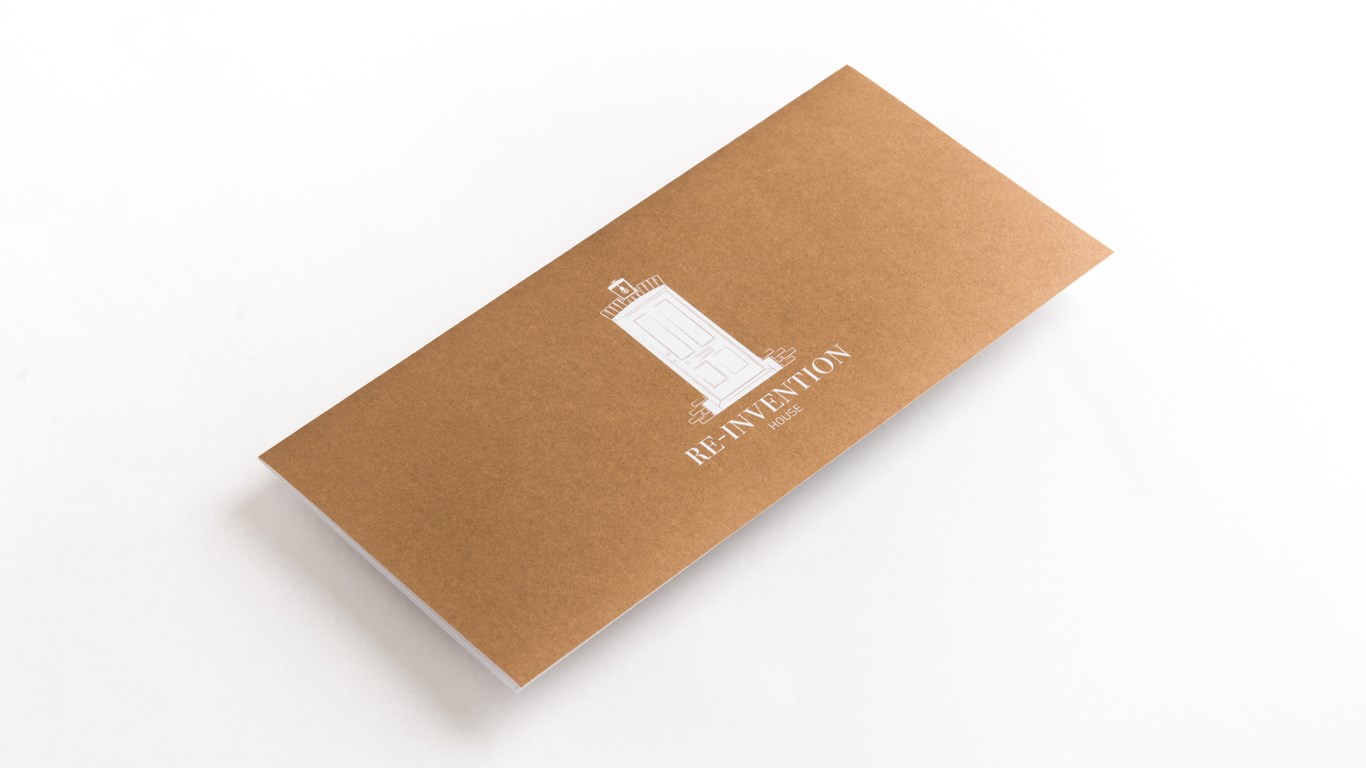
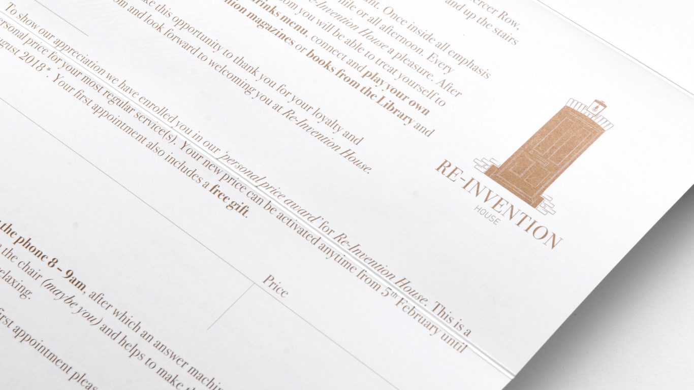
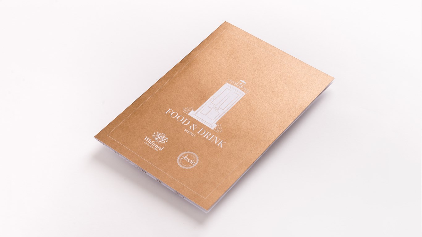
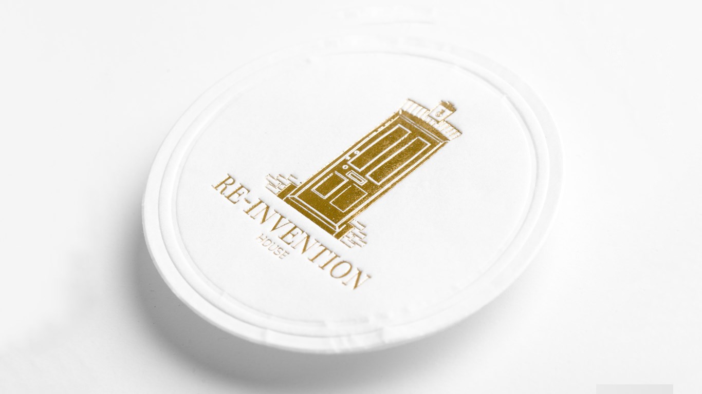
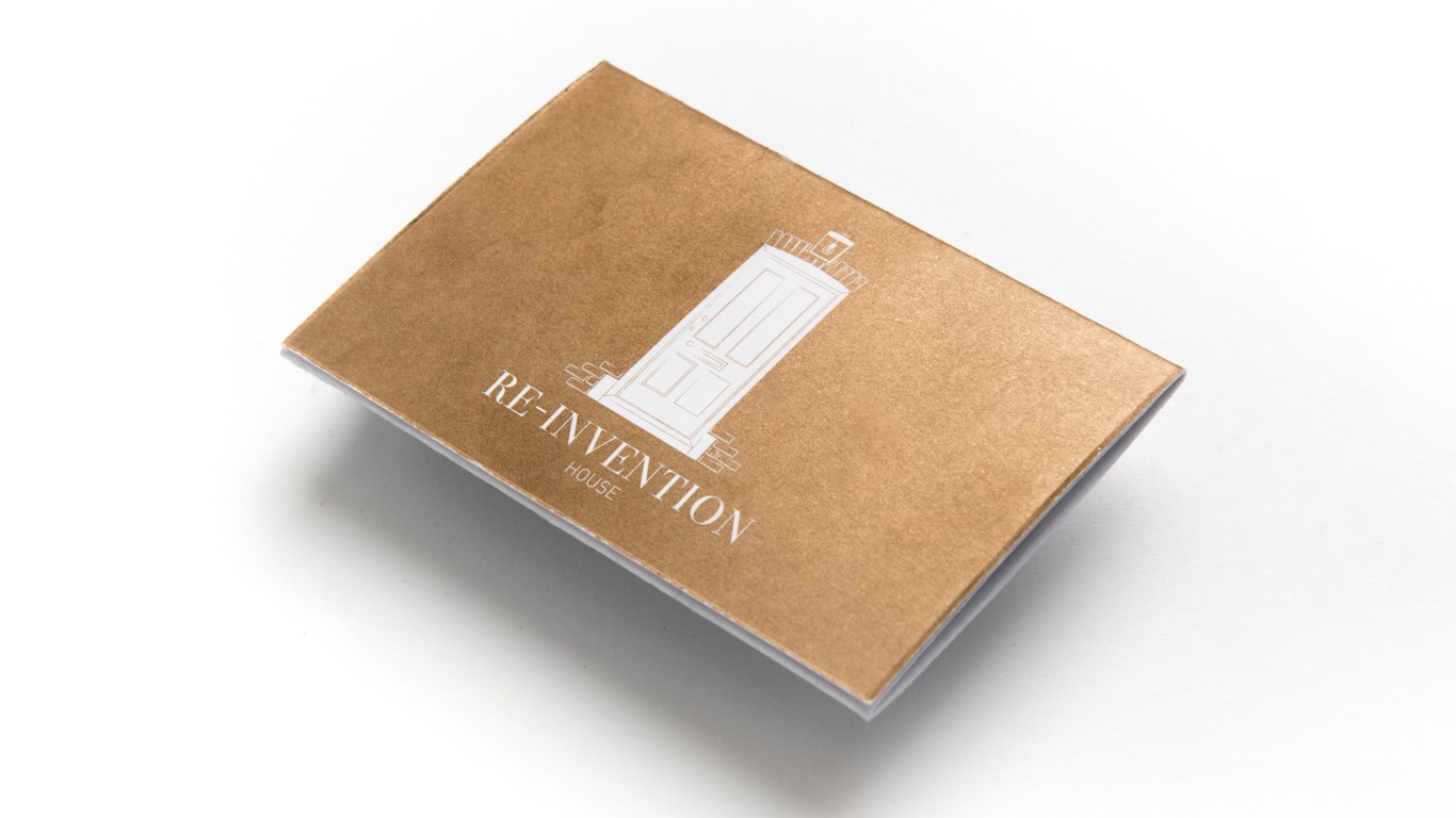
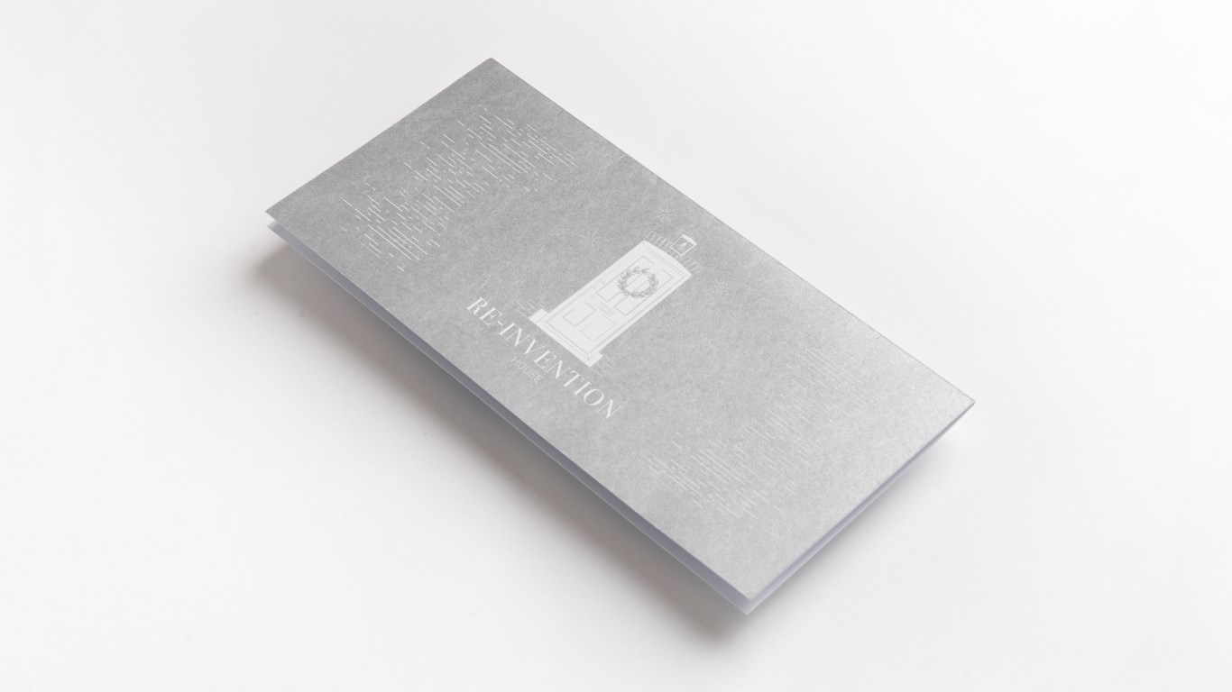
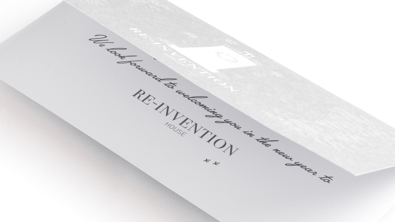
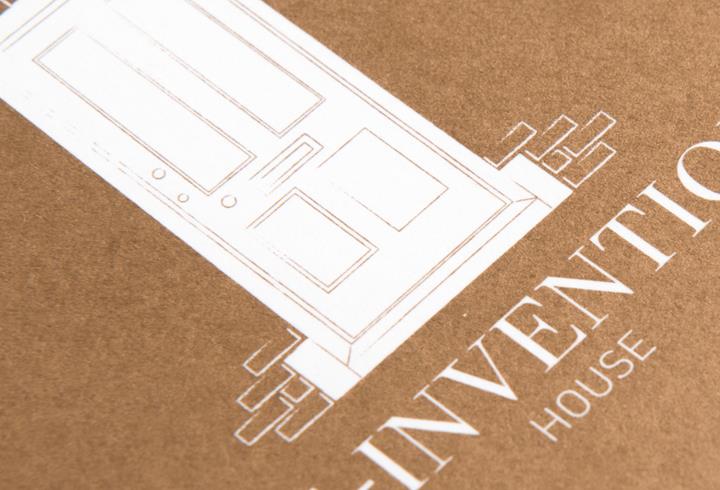
RE-INVENTION HOUSE is a concept salon, offering a truly unique experience between stylist and guest not seen before in Louth and the surrounding area. We navigated Jak (owner) through many branding ideas and themes eventually settling on a lovely illustration of the salon’s own door. Setting this above the typeface Bodoni, used on the covers of VOUGE and HARPER’S BAZAAR to give a sense of elegance and sophistication. We introduced a second sans serif typeface to contrast with the traditional look of Bodoni and the illustration.
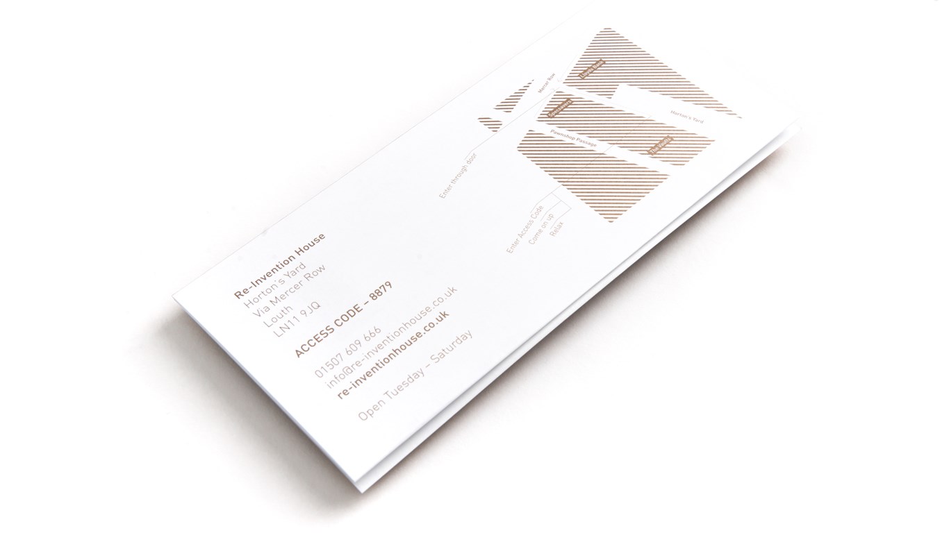
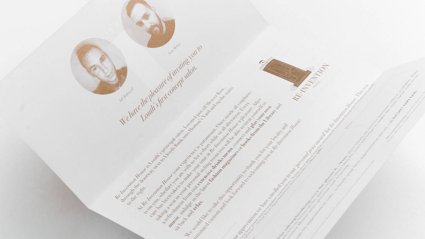
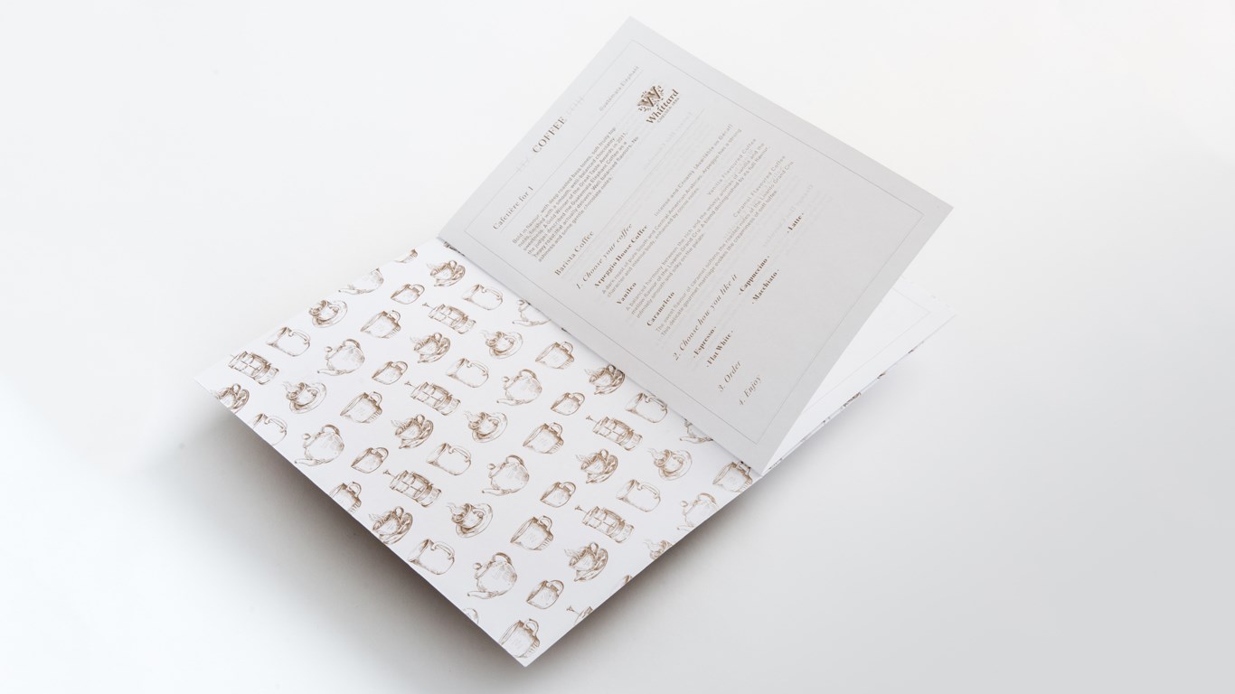
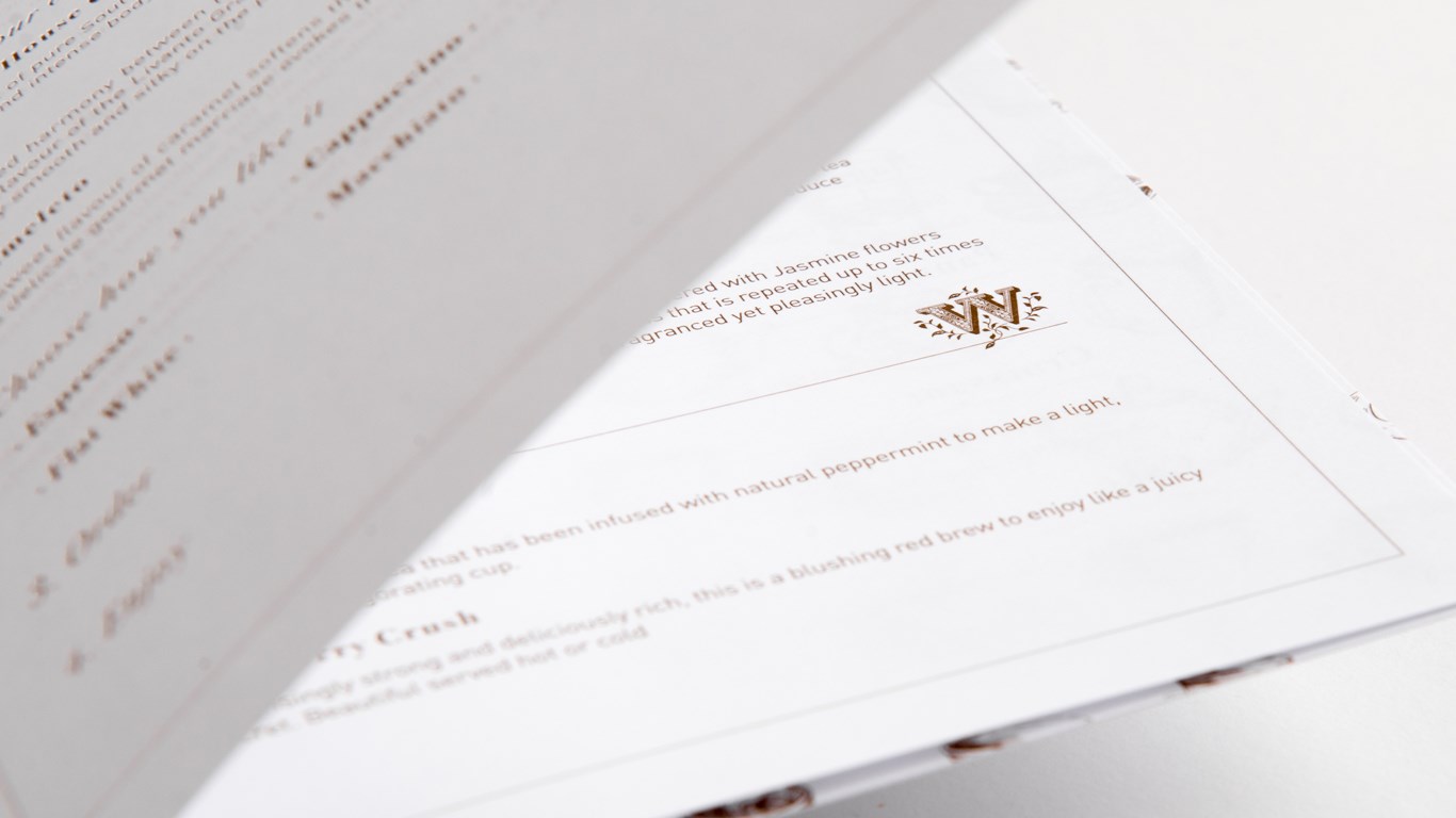
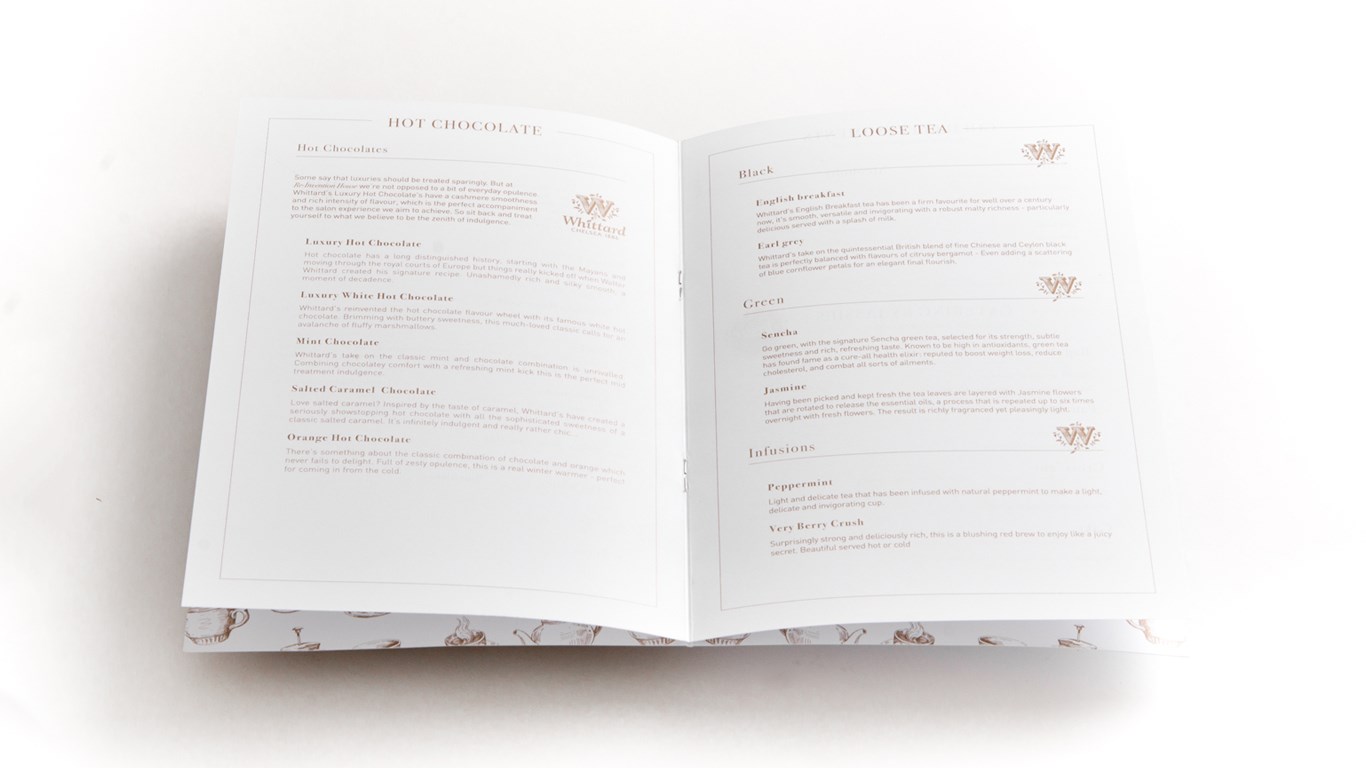
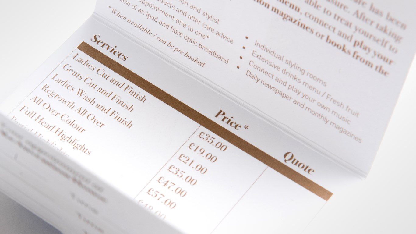
Designed and printed material included a personalised letter introducing the salon to customers. A food and drink menu featuring illustrations of cups, tea pots and cafetieres mirroring the logo style. Both printed in a metallic bronze ink. From very early on in the process we had decided on our paper stock, Conqueror CX22 Brilliant White. A super smooth, dense paper that lends it’s self to sharp printing and good ink coverage. The brilliant white nature of the paper helps to highlight the reflective nature of the metallic ink in a way that set it apart from other options.
