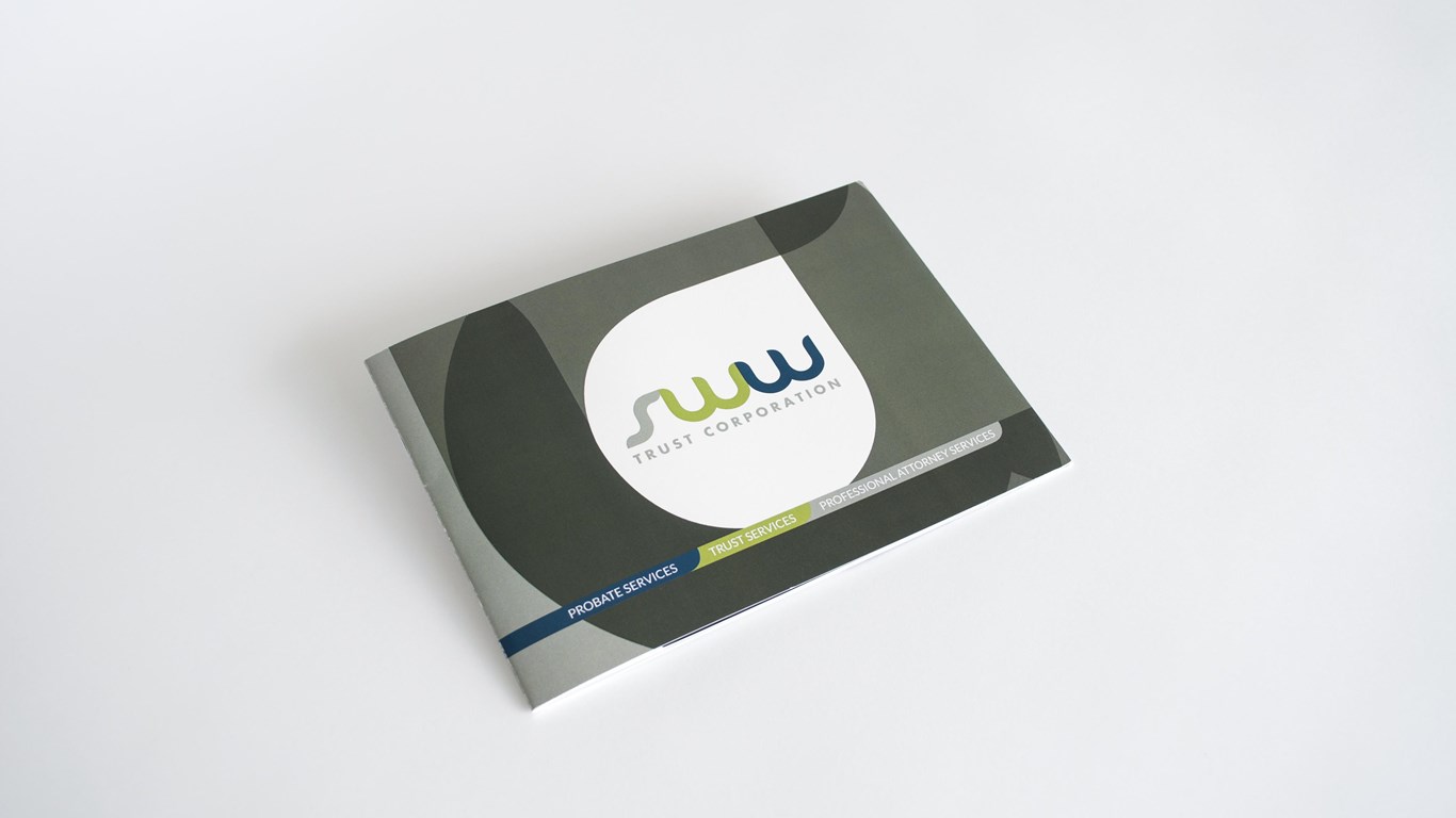
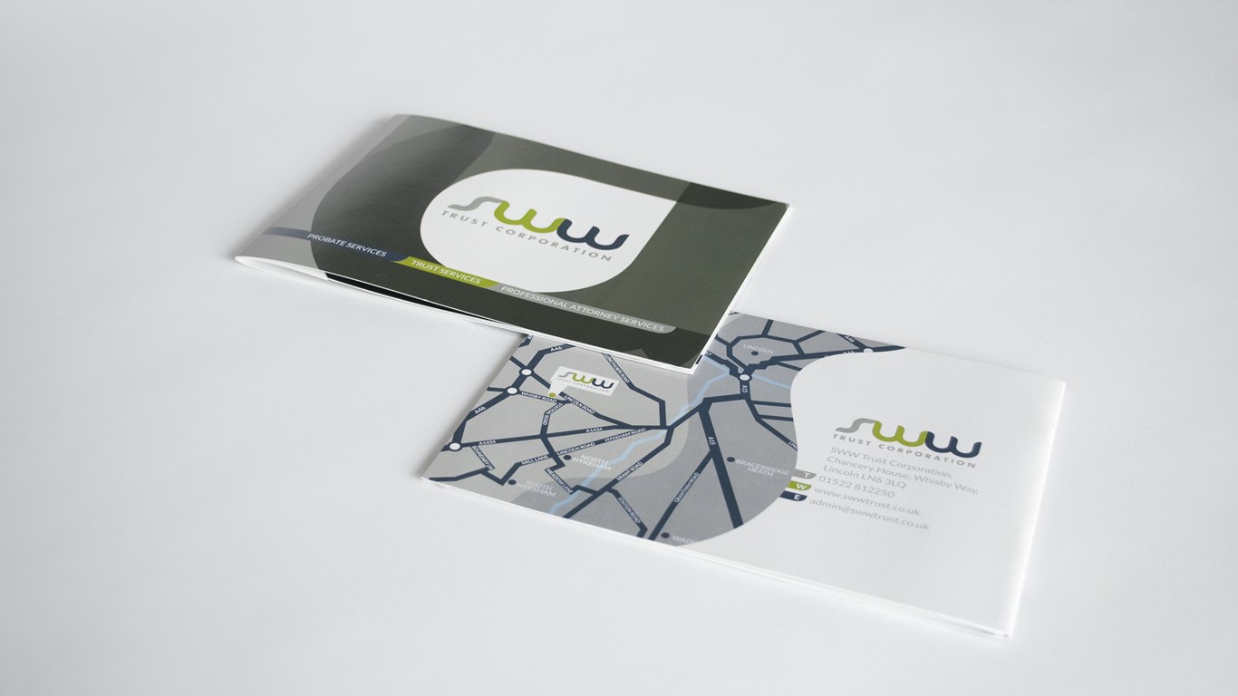
We were approached by SWW Trust Corporation to help them put together a company brochure that would
show all aspects of the business in a clear and cohesive manner. They had recently had a change of branding
and wanted the brochure to match the fresh modern feel of their new logo, making use of the change in
corporate colour and type style, they wanted all areas of their business to be in one brochure rather than
three as had previously been the case.
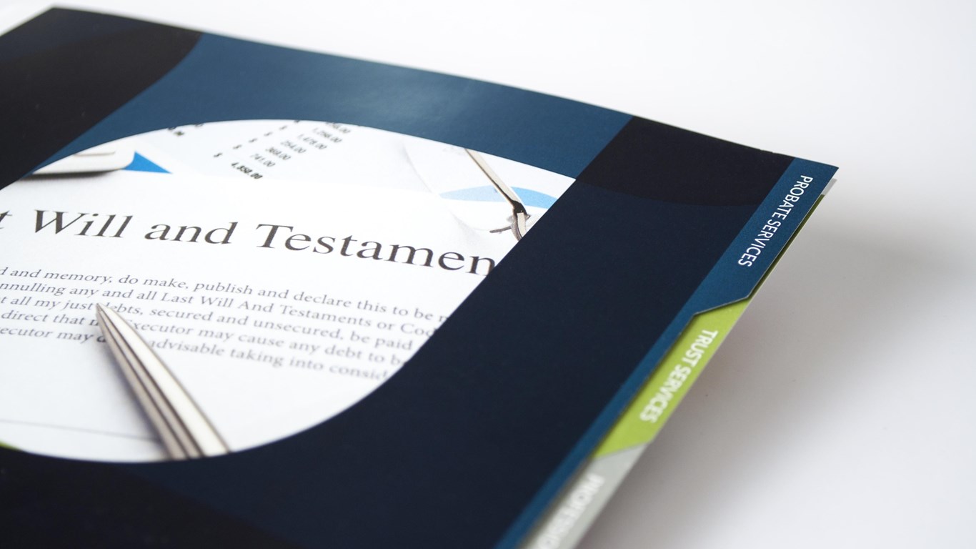
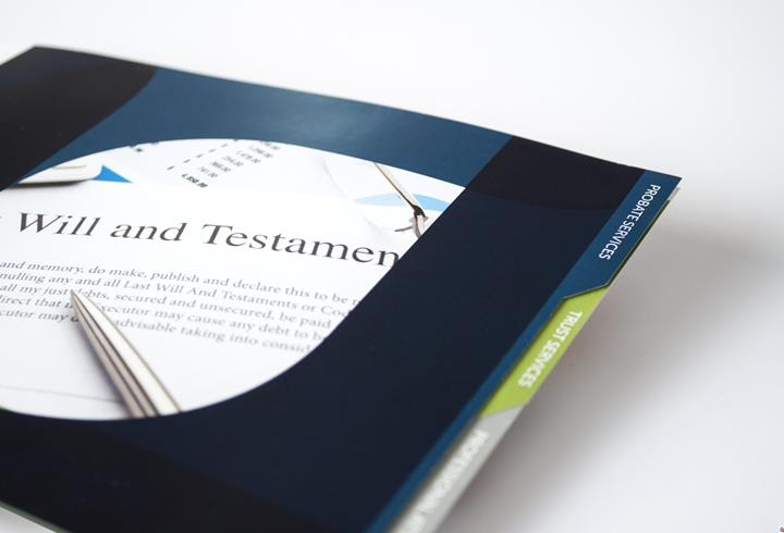
We decided on a tabulated system for the brochure to help separate the individual sections in to easily
digestable and coherent units, using each of their corporate colours to represent each of the three sections.
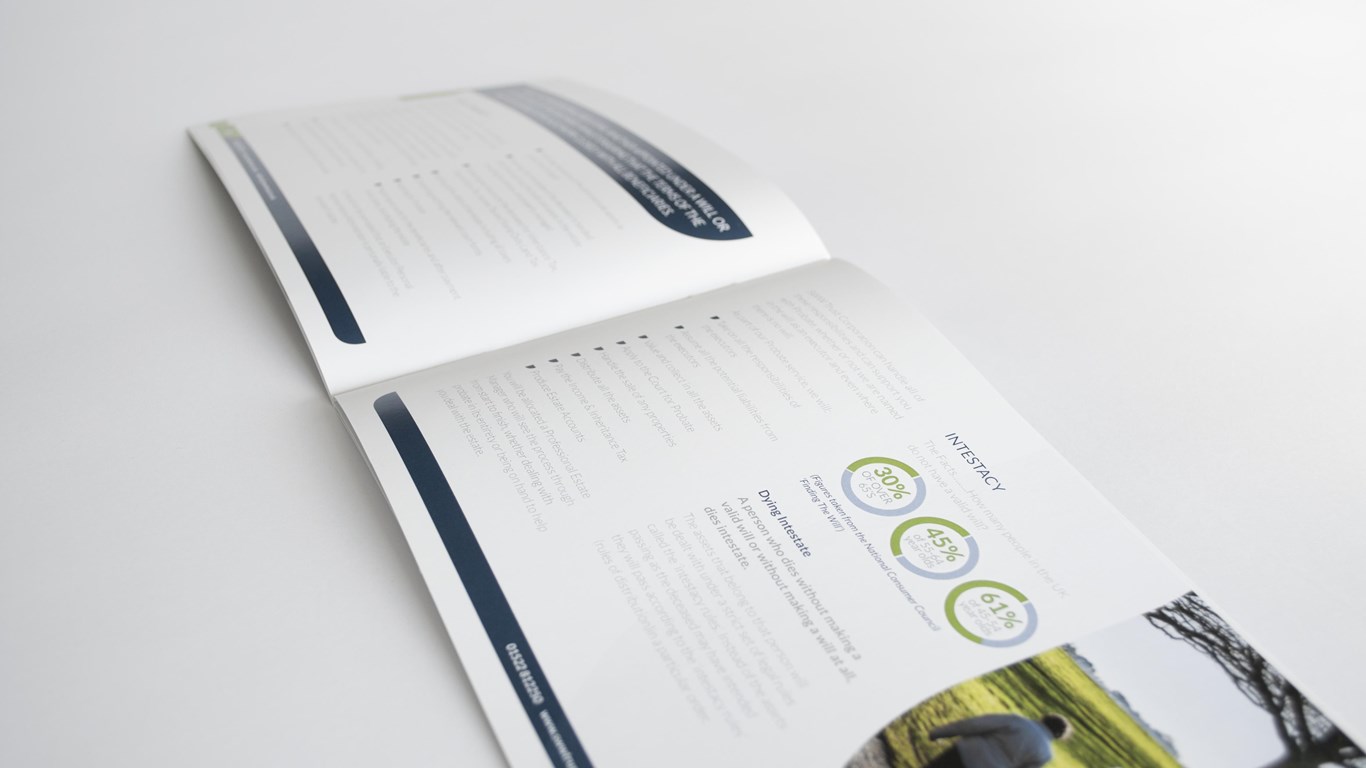
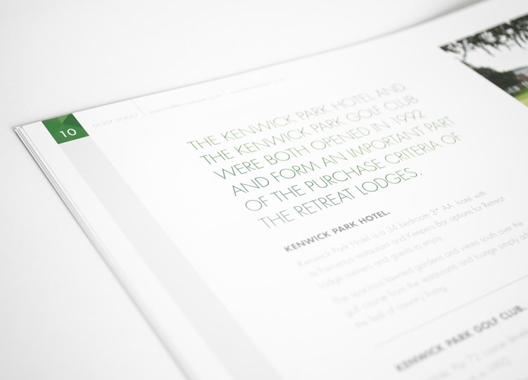
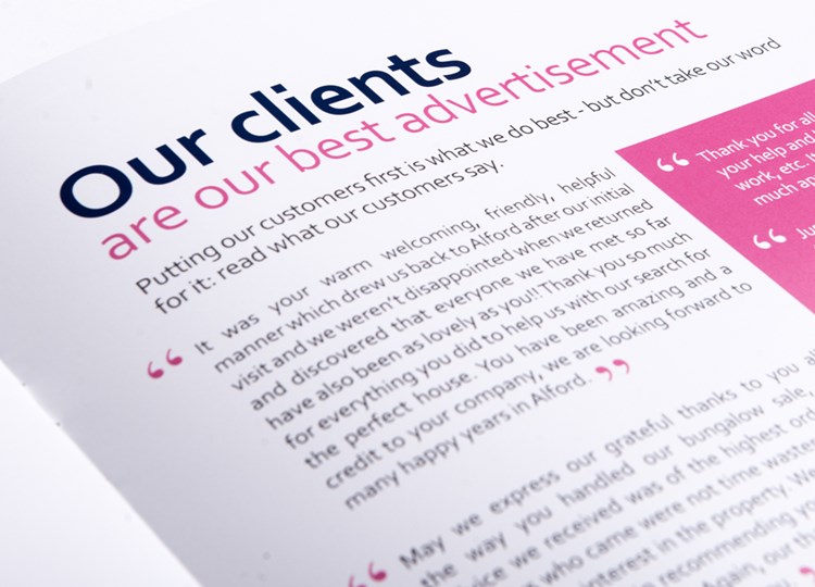
We chose the typeface Lato as we felt its clean, readable quality further added to the modern, crisp look of
the brochure, images were chosen that further enhanced this look and feel all of which came together to
make the information, serious as it was, welcoming to read. We used blown up parts of the logo lettering
to form bullet points and photo borders to to help emphasise this new look and feel.
