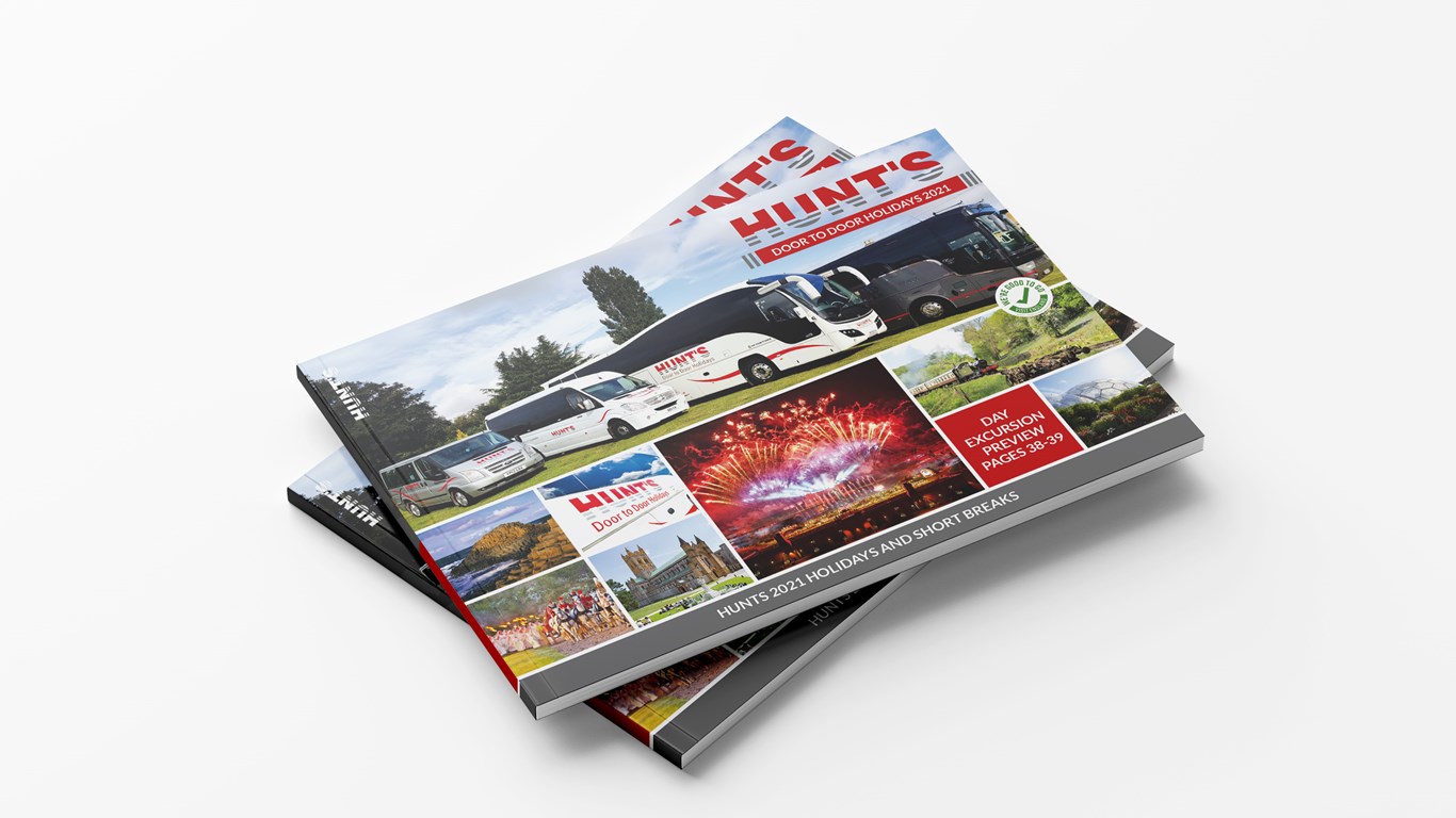
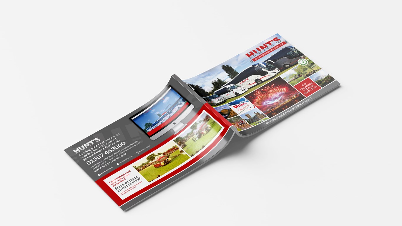
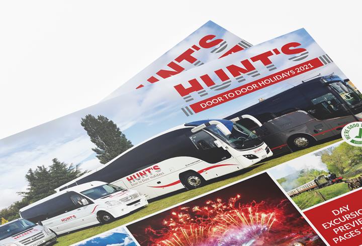
Hunts wanted us to look at a re-design of their 2021 excursions brochure, they wanted it to be something
that was easy to navigate, read and inspire customer confidence in how under challenging circumstances
they were keeping their customers safe whilst transporting them to some wonderful holiday destinations.
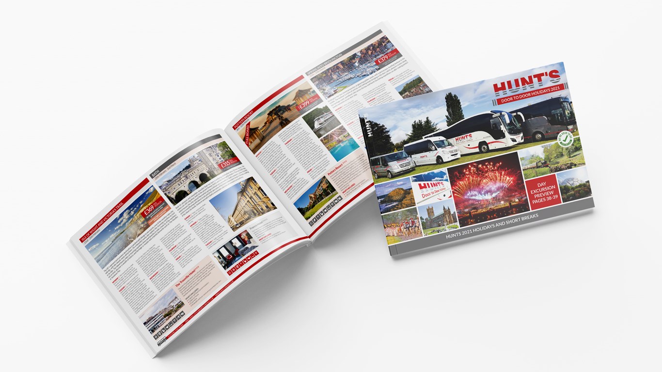
We wanted the brochure to have an easier effortless flow and made a conscious effort to let the information
breathe on the page. We tried not to overfill the pages with too much text and where possible edit the text
down to fit the design better. We changed the typeface from last year as it made the copy seem a little
cramped. We utilised a far more modern sans serif typeface which had much better form and readability
even at a lighter weight. We complimented the white space with the Hunts corporate colours picking out
elements of interest to draw the eye. Designing easy to follow icons to help explain what facilities each
hotel had further added to our plan to help the brochure to be easily understood and followed.
